
 Yahoo News
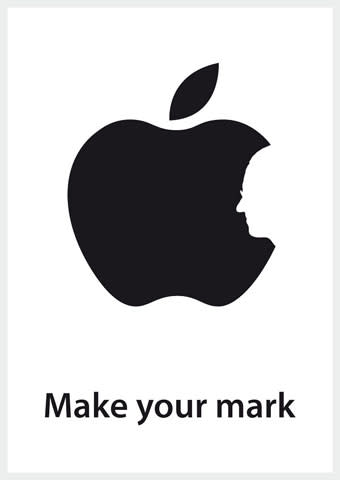
Origin of Steve Jobs tribute disputed
The design that became an emblem for millions following the death of Steve Jobs has had its origin called into question.

The modified black and white Apple logo, featuring a silhouette of Jobs in place of the standard bite, became an instant hit across the globe following the death of the Apple founder on 5 October.
Hong Kong-born Jonathan Mak, 19, who became an overnight sensation for the design, woke up to job offers after impressing the world with his concept, with many people – including actor Ashton Kutcher –using the logo on their social networking profiles.
But it has since emerged that British graphic designer Chris Thornley, 40, of Darwen, Lancashire, created something remarkably similar to it back in May.
The differences between the two designers’ concepts are the colour of the background and the positioning of Steve Job’s face within the Apple logo.
Hong Kong Polytechnic University student Mak said Mr Thornley’s wife, Julia, first notified him last Sunday night about the similarities.
Mak maintains that he didn’t plagiarise Thornley’s idea. He told Reuters: “I didn't rip off his work. I still arrived at the solution on my own, and my conscience is still clear, but I'm more than happy to acknowledge the fact that somebody did it before me.”
[Gallery:Steve Job's life in pictures]
The British designer – who is also known as Raid71 on the Web – told The New York Times that he had followed the controversy while receiving treatment for a rare form of non-Hodgkin’s lymphoma.
He said: “I wanted to celebrate the fact that someone who had cancer was still working, still driving forward and still thinking positively about the future.
“The Internet can be a double-edged sword,” he said. "You need to use the Internet in order to promote yourself, but in order to do this you are making yourself vulnerable to these situations.”
Mr Thornley reportedly said he would like to speak with Mak to settle the issue.
