
 Yahoo News
 Covid-19 vaccine Australia rollout tracker: per cent of population vaccinated and vaccination rate by state
How does Australia’s coronavirus vaccine rollout and schedule compare with other countries, and when will Australia reach 80% and 90% third dose vaccination? We bring together the latest numbers on the vaccination rate in Victoria, NSW, Queensland and other states, as well as stats, maps, live data and Indigenous vaccination rates.
Vaccine rollout data by country shows who has vaccinated faster – and why
Get our free news app; try our weekend edition app; get our morning email briefing
Australia’s coronavirus vaccine rollout began in late February 2021. Here we bring together the latest figures to track the progress of the rollout and Covid vaccination schedule.
The data shows the total doses given in Australia, people vaccinated in Australian states and the percentage of the population who have received one dose or are double dose fully vaccinated, as well as graphs showing daily new Covid-19 cases in Australia, deaths per day and cumulative coronavirus cases by state and territory.
default
default
Vaccine rollout: national and state progress
One of the biggest logistical exercises in Australia’s history, the delivery of coronavirus vaccines to more than 20 million people was slow to start due to supply issues and concerns around the AstraZeneca vaccine.
The government was initially hoping to have 4 million people vaccinated by March 2021 and the entire country inoculated by October. Since then, goals, targets and “horizons” have come and gone.
However, in December 2021 the country had vaccinated 90% of the population aged 16 and over, and begun the rollout of boosters.
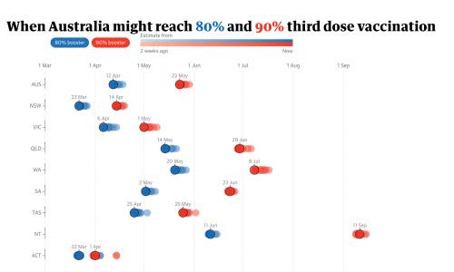
Here, you can see the how the booster rollout is progressing and when we might reach various thresholds. The trendline is based on the boosters administered, then taking the most recent interval between second and booster doses, and adding this to the date of the second dose.
This is obviously a very simple estimate of the time it might take, and will change as the vaccination rate increases or decrease.
It also shows the current “lag time” for boosters, that is the time interval between when the equivalent number of second and booster doses were administered – this essentially tracks the delay between second and third doses, which ideally would be as close to four months as possible if the majority of people were getting their shots as soon as they’re eligible.
default
Here you can see current vaccination levels and when each state and territory hit targets, using the same method as above:
default
Here are the current vaccination rates for each state and territory by various age ranges, as well as the booster vaccination rate:
The next chart shows the speed of vaccinations in the past 30 days for each state and territory, versus the national rate.
It is showing the number of new vaccination doses administered per day, adjusted for population differences to be a rate per 1,000 people. Then, it has been smoothed using a rolling 7-day average due to differences in reporting on weekends and data catch-ups in the national reporting.
This chart does not currently include boosters, but they will be added shortly:
Vaccine rollout: maps of vaccination rate by area
The federal government releases weekly data for vaccination rates by statistical area 3 (SA3) regions. This map shows the current first and second-dose vaccination rates for each region, as well as the weekly increase in the percentage of fully vaccinated people.
The data for first and second doses is capped at 95%.
You can use the dropdown menu to switch between showing the vaccination rate for each area, and the percentage change in vaccination rate for each area:
Here, you can see the same information in a table, which can be sorted by region name, state or the change in vaccination percentage:
Vaccine rollout: Indigenous vaccination statistics
Guardian Australia has been tracking the vaccination statistics for Indigenous Australians since August 2021. While Indigenous Covid vaccination rates have risen rapidly, there remains a large gap between First Nations people and overall vaccination rates in almost every state and territory.
These charts have switched to using Indigenous population data sourced from the Australian Immunisation Register instead of ABS population estimates. This means the percentages for some states have changed significantly, such as in Victoria.
Here, you can see national figures for the Indigenous vaccination rate over time compared with the overall vaccination rate, and the difference between the two:
This chart shows the latest rollout gap for each state and territory, with data updated weekly:
Vaccine rollout: vaccine production and distribution
Some of the reason for the differing vaccination rates is due to access and use. The following two charts show the vaccine distribution and estimated usage by states, territories, and primary care (run by the commonwealth). This data is updated weekly.
Vaccine dose usage is estimated by the commonwealth government, based on the total doses administered and allows for a small amount of wastage.
Vaccine rollout: international comparison
In the following two charts you can see how Australia’s vaccine rollout compares with other countries, in terms of doses administered per 100 people.
This first chart adjusts for the fact that countries started administering vaccines on different dates. It shows how Australia compares to select countries at equivalent points in their vaccine rollouts.
Here you can see how those same countries are doing across their entire vaccine rollout, on a doses administered per 100 people basis. Some are already more than halfway to vaccinating their populations.
Not all countries publish data on fully vaccinated people - those who have received two doses. Here you can see how Australia compares to OECD countries on the percentage of the population that are fully vaccinated.
Where can I get vaccinated?
The majority of Australians aged 18 and over are now eligible for a Covid vaccination if they are willing to consider the AstraZeneca vaccine, and provided they do not have a history of some specific health conditions.
In addition to the government’s official eligibility checker, which lists some clinics near your location which might have vaccination appointments available, there are a number of other helpful resources that can help you to find somewhere that has appointments open. You can find our page listing these resources here.
Latest Australia Covid numbers and statistics
Due to the issues with testing accessibility and the change in testing criteria, case numbers from mid-December onwards should be considered an underestimate at best. For the moment, it may be better to track the progress of the outbreak via hospitalisation statistics rather than case numbers.
Here, you can see the number of patients in hospital nationwide, along with occupancy thresholds based on the federal government’s ‘common operating picture’ document.
Here, you can see the number of new deaths reported per day by the states and territories:
Updates 19 January 2021:
Changed vaccine stats table to new metrics
Temporarily removed the national cases chart
Removed cumulative cases chart
Updated text
Added hospitalisation chart
Updates 29 November 2021
Updated maps to use SA3 areas
Added 90% 16+ targets to bubble chart
Updates 15 October 2021
Updated main rollout target chart to use the first dose + lag time projection method
Fixed an issue with scrolling in the Guardian app
Removed the doses per 100 people by jurisdiction line chart as it’s less useful with so many doses being administered via GP and other clinics
Updates 17 September 2021
Updates to how Indigenous vaccination statistics are presented, now using the 12+ population for both Indigenous and non-Indigenous
We have changed the way we’re projecting second-dose targets, as outlined in the text above. We have temporarily removed the chart with state-by-state target progress and will replace it shortly with a new chart that uses the new method
Updates 11 September 2021
Production and distribution section is back
Removed hospitalisation percentage chart, this will be replaced shortly with a new chart that doesn’t use active cases
Fixed the cases trend line to stop using the latest day which usually has incomplete data
Updates 6 September 2021
Removed production and distribution section
Added vaccination maps and tables for each area
Re-added the table of rollout projections
Updates 29 August 2021
Added Indigenous vaccination statistics
Added ‘Where can I get vaccinated’ section, replacing ‘When can I get vaccinated’
Updates, 9 August 2021
Retired the “gap tracking” version of the rollout chart, and replaced it with a new chart that tracks progress towards the government’s latest goals of 70% and 80% of the 16+ population
Changed the summary box to remove the percentage of the population who have only received a single dose, and added the percentage of the 16+ population who are fully vaccinated to allow both international comparisons and progress towards the government’s targets to be clearer
Removed the government’s projections of future vaccine availability as they’re not realistic
Added a new chart showing the speed of vaccination by state and territories
Due to the unprecedented and ongoing nature of the coronavirus outbreak, this article is being regularly updated to ensure that it reflects the current situation at the date of publication. Any significant corrections made to this or previous versions of the article will be footnoted in line with Guardian editorial policy.
default
