
 Yahoo News
 Designer Nick Olsen Brought the Hollywood Hills to This Brick House in Ohio

In 2020, the eponymous design firm of ELLE Decor A-List designer Nick Olsen is celebrating its 10th anniversary. Over the past decade, Olsen has become known for a distinct approach to interiors—he combines a stripped-down modern sensibility with an appreciation for the classical, and he has a knack for introducing bold colors and patterns. Along the way, Olsen has completed nearly 50 projects, from Los Angeles to Locust Valley, New York.
“I love high style mixed with something ordinary or strange,” Olsen says. “My style owes heavily to the decorating greats, but I combine elements in a way that feels fresh to me and, hopefully, conveys a sense of humor.”
After graduating from Columbia University, Olsen began working for the esteemed designer and fellow ELLE Decor A-Lister Miles Redd; during his time learning from Redd, Olsen says, he realized he’d found a line of work that suited him well.
Here, Olsen shares what makes his business tick and how he and architect Ryan Duebber transformed a brick home in Cincinnati, originally built by modernist architect Carl Strauss, into a bright and airy space fit for a family from New York.
ELLE Decor: What were your goals for this Cincinnati house?
Nick Olsen: This is my third project for a very dear client—and our second collaboration in Ohio. I met her when she was a new mom in New York, and her family has really grown! They moved from a fairly cookie-cutter house in the suburbs to this brown brick pile in a hilly, leafy neighborhood. Her design direction began and ended with “I want to bring the Hollywood Hills to Ohio.” I could not have been happier.
ED: So how exactly did you do that? How does one bring the Hollywood Hills to Ohio?
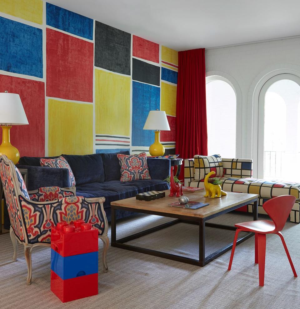
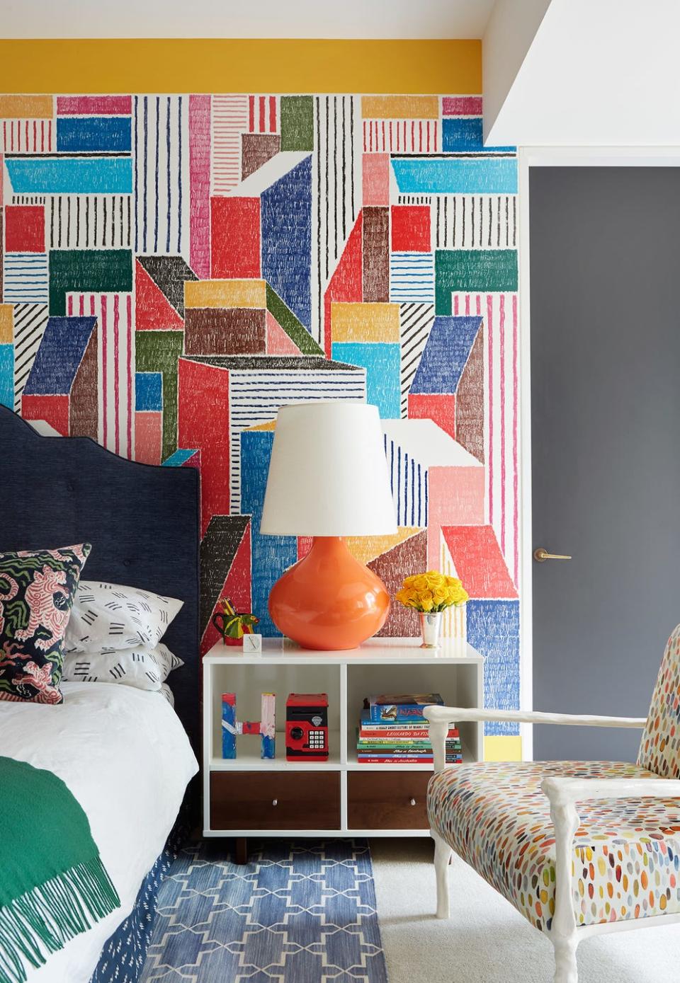
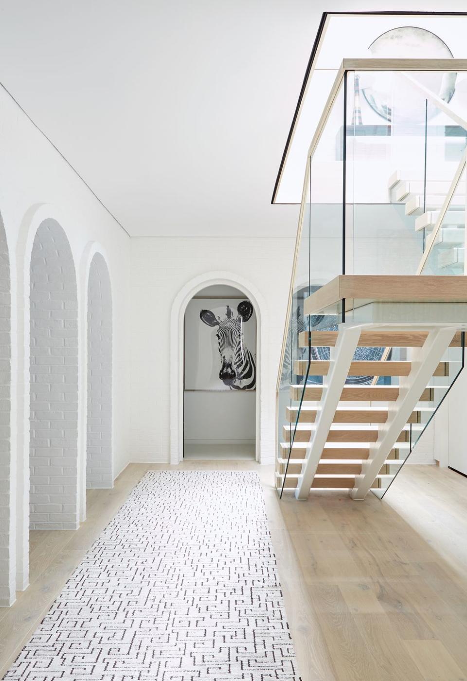
NO: Beyond whitewashing all the brick, inside and out, I wanted to make the best use of some huge living areas. The great room is more than 50 feet long, so I had to create conversational and work zones to keep the space from feeling intimidating to anyone entering the room. Also, the clients’ previous home had a lot of colorful wallpapered rooms, but the living areas in the new house had brick and floating walls that forbade us from using any colorful wallpaper in those areas. Instead, I focused on smaller bursts of color and pattern in the upholstery, on ceilings, and with one fabulous midcentury tapestry in the dining room. Finally, Ohio’s climate doesn’t quite match that of Southern California, but we tried to bring the outdoors in as much as possible. We didn’t install curtains in the great room or dining room, so your eyes are at tree level and you’re welcomed onto the massive terrace.
ED: You did wind up using bold colors and Mondrian-inspired prints in numerous places, though.
NO: Pattern-wise, I considered mimicking the house’s repeating arch motif—which now I see everywhere—but decided that was too obvious. Mondrian and the other De Stijl artists paired right angles with primary colors, which felt like a better foil to all of the white arches. It’s modern, yet fun and not too austere. In many rooms, I reused pieces from the owner’s previous home, and those set our palette. In one instance, we turned their old primary-colored curtains into throw pillows, and those colors dominate our wild Porter-Teleo-does-Mondrian wallpaper in the kids’ play area. Of course, there are more subtle patterns in the house, like a harlequin print from Pierre Frey on the great room armchairs, and lots of blues and greens. The client’s only color-related ask was that there be no aqua, but the rest of the spectrum is represented.
ED: How did you balance out all the bright colors?
NO: With acres of white brick and pale oak floors! The hearth room off the kitchen has two Jean-Michel Frank-style club chairs in Josef Frank’s Hawaii print, which has a dark brown field but tons of bright colors to pull out. Its sunshine yellow became that room’s curtains, and it pops up on lounge chairs in the great room and then again downstairs. It’s important to weave a thread of certain colors throughout the house without it feeling matchy-matchy, and without overwhelming any one particular room.
ED: The house was originally designed by noted modernist architect Carl Strauss. How did that affect your approach to the interior design?
NO: Early in this project I joked on Instagram, “Blessed Carl Strauss didn’t live to see my paint schedule.” I wasn’t familiar with Strauss’s work before, but apparently, he designed and built this house for his mother in the early 1970s, who requested Palladian symmetry. That pleased me so much—a modernist architect bowing to his mother’s classicist wishes. The clients’ architect, Ryan Duebber, really respected Strauss’s symmetrical main-level plan while modernizing the kitchen and central staircase and reconfiguring the warren-like series of bedrooms and bathrooms downstairs. I personally pushed hard to replace all the ugly wood floors with wide-plank white oak and, of course, to paint all the brick a warm white. Strauss’s imprint is still here, but now the house feels lighter and much younger.
ED: Aside from those ugly wood floors, were there any other design obstacles you had to overcome?
NO: It sounds silly, but the sheer volume of rooms: These clients are blessed with four living rooms, so I tried to carve out different uses for each one and set different moods with the decorating. One serves as the kids’ art room, another is for TV watching, and yet another is for reading a book or working at a laptop. Overall, this project was a breeze, mostly thanks to the clients’ patience and enthusiasm.
ED: Where did you find your inspiration for this house? Do you have any go-to sources that always inspire you?
NO: I started by looking at the De Stijl-era works of Gerrit Rietveld and later houses by Richard Neutra and Craig Ellwood, which are far less symmetrical and have more fully integrated cabinets and furniture. Those houses helped me embrace the negative space in this project—for instance, the way the large square library table dominates one half of the great room. I was also inspired by the contemporary work of designers like David Netto, Paul Fortune, and my friend Billy Cotton, whose beautiful sofa design I used in the great room, in a neutral fabric. They all embrace sophistication and fun! As for general inspiration, it’s a cliché but I travel as much as possible, from visiting house museums in upstate New York to Sunnylands in Palm Springs. I’m dying to visit Sicily. I love Instagram, even though it drives me to distraction—Miles Redd pops up on my feed every morning to inspire me, and I love weird niche accounts like @bizarrecolumns. It mostly features strange, postmodern uses of columns!
ED: What was your favorite part about this project?
NO: Being able to decorate a modernist house, and having the pleasure of working with these clients. A year after we installed it, the owner told me, “We use every room in this house, and we love it.” Mission accomplished!
ED: As we head into a new decade and you celebrate your firm’s 10th anniversary, what trends do you hope to see more of? Which would you like to leave behind in the 2010s?
NO: I’m encouraged by the trend toward very personal interiors, as opposed to safe or status-conscious decorating. They’ve always existed, but they seem to be celebrated more lately. I hope to see more confident, out-there design work, like what my friend Sasha Bikoff is doing. I could do without what I call the “Pinterest Regency” aesthetic—white-oak arches, pink and green everything, neon signs à la Tracey Emin. It’s been done.
ED: What’s your dream project?
NO: A Paul Rudolph beach house in Sarasota, Florida. Or Oak Knoll on Long Island.
ED: Any exciting projects coming up?
NO: I’ve been approached about a book, but I know they’re an enormous amount of work. We’re busy enough with longtime and new clients and must keep them happy! However, 2020 is the year I will sit down and design fabrics and wallpapers, I swear.
You Might Also Like

