
 Yahoo News
 A front page doesn’t have to be broadsheet to have gravitas
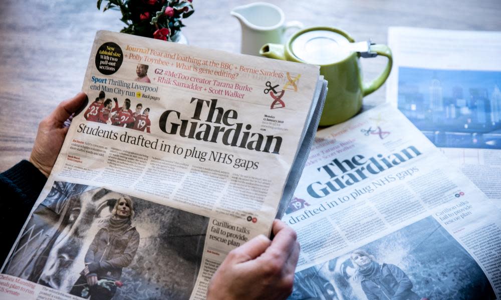
A reader recently wrote that on returning to the UK after seeing newspapers abroad he suddenly realised that what disappointed him about the tabloid Guardian was the “lack of dignity” that he perceived in the design and colours of the front page.
“In contrast, the front pages of [El] País, Le Monde and the serious German papers are restrained, as befits the high quality of content and journalism within them. But the Guardian is a class paper too, so why conceal this on a front page presumably designed for the masses?”
In journalism, quality includes notions such as reliability, and affects readers’ willingness to invest their trust
In the reader’s constructive critique (“a newspaper I much admire”), what caught my attention was the implicit issue about the potential for presentation of news to be perceived by readers to signify the quality of the content. In journalism, quality includes notions such as reliability, and affects readers’ willingness to invest their trust. Without trust, newspapers are diminished as contributors to democratic societies.
It may be that widely held views of newspaper design that befits high-quality content result from the days when technology limited what could be done in the available time. Perhaps unavoidable constraints became understood as desirable restraint. Much more can be done now with text and images to convey the news and opinion that professionals gather and curate.
Tastes will always vary, of course, but I would encourage readers (of any newspaper) to re-examine some long-held perceptions such as: broadsheet size good, tabloid bad; text-heavy equals information-rich; bold imagery and colour mean inconsequentiality. All these might still apply in particular contexts, but so might their opposites, without loss of quality and often with enhancement of it. In my view, in presentation (content is another issue) digital technologies affect beneficially the print newspapers that preceded them.
For the editor-in-chief, Katharine Viner, “The serious intent of Guardian journalism in a tabloid cannot be in doubt … We used a variety of colours and designs to make our pages beautiful and appealing, and I don’t believe that undermines the seriousness of our intent in any way.”
Alex Breuer, the executive creative director, explained that a range of designs and styles complement the range of journalism. “Thechallenge of creating the appropriate space for such a rich range of tones in the confines of a tabloid newspaper is demanding.
“For the eye to effectively navigate and interpret the changed content of the sections dictates changes of visual pace. Moments of drama in layout and visual accents in the design … guide the reader from news reporting through analysis and opinion to features …We strive to deploy colour palette, typography and layout to reflect the urgency and sobriety, energy and wit of our journalism. The passion with which our readers share their opinions of our approach to design is exciting and gratifying … to some we are decorous and to others decadent.”
As Breuer noted, design evolves, with reader feedback in mind.
• Paul Chadwick is the Guardian’s readers’ editor

