
 Yahoo News
 Very Peri: how to bring Pantone’s colour of the year into your home — from accents to Friends-level commitment
Associated with magic and death, the periwinkle flower is the inspiration for Pantone’s colour of 2022.
The pros at colour institute Pantone say the new shade — blue mixed with a violet red undertone — reflects the way our online and offline worlds have collided over the last year.
But, with a rich history in folk medicine and used for magical charms in the Middle Ages, there’s more to periwinkle than its jazzy purplish-blue hue.
Periwinkle was commonly refered to as “sorcerer’s violet” by superstitious Europeans in medieval times and was thought to contain power to dispel evil spirits.
As much as we’re fans of that kind of power given the current state of, well, everything, we should point out that it’s not recommended for medicinal purposes today as some compounds (alkaloids) found in the plant cause serious side effects.
Two of the alkaloids, however, are used in important prescription drugs after Western scientists followed the lead of a spiritual healer in Madagascar who used the variety of periwinkle that grows there to treat tumours and cancer.
Named colour of the year for 2022, the periwinkle-inspired Very Peri is a modern, magical colour with exactly the type of optimism we need for the year ahead.
Some of our favourite ‘grammers have already gone all-in with the hue, here’s how to tap into that purple pizzazz.
@tierneyterracelocation
If Very Peri is about moving upwards and onwards this coming year, then painting stairs in the optimistic shade seems appropriate. And this is a colour that “encourages courageous creativity and imaginative expression," after all.
@grahamandbrown
Liven up neutral spaces (and balance out the boldness) with a pop of Pantone’s playful colour. A couple of cushions will work just as well as a painted wall, if you’re not ready for that level of commitment right now.
@krujok.cafe
No you’re not dreaming. This Russian cafe’s designed to resemble a deconstructed doughnut – and the velvet Very Peri-esque walls look good enough to eat. The perfect blend of real life and fantasy for this oh-so meta colour.
@mustardmade
Make the ethereal colour work hard in your home with storage in the on-trend tone. Pretty and practical? It’s a win, win situation.
@lululovescandles
It’s big and bold, but a little goes a long way. Case in point? The subtle terrazzo speckles of this handmade dish.
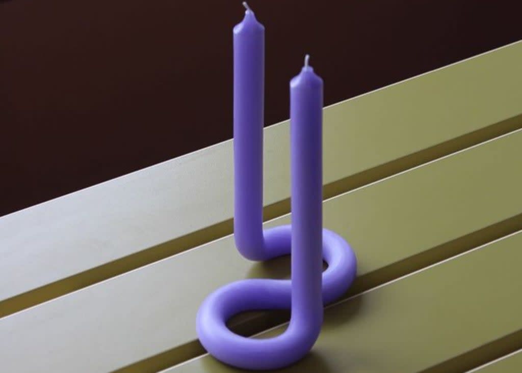
@lexpott
Not sure if Very Peri is a very you hue? Start small, with an accessory in the vibrant violet shade – like Lex Pott’s Instagram-approved twisted candle.
@zahahadidarchitects
The curved violet canopy found in the Mathematics Gallery at the Science Museum was clearly light years ahead of the trend. Designed by Zaha Hadid Architects and inspired by Handley Page’s 1920s aircraft, the huge three-dimensional curls represent airflow equations. We’re thinking: mood lighting ideas.
@tom.lowe
And if you’re wondering where you’ve seen the shade before? As one Instagrammer cleverly observes, it could have been called Very (Matthew) Perry…

