
 Yahoo News
 Why St Rocco's Hospice has updated its branding and what changes it has made
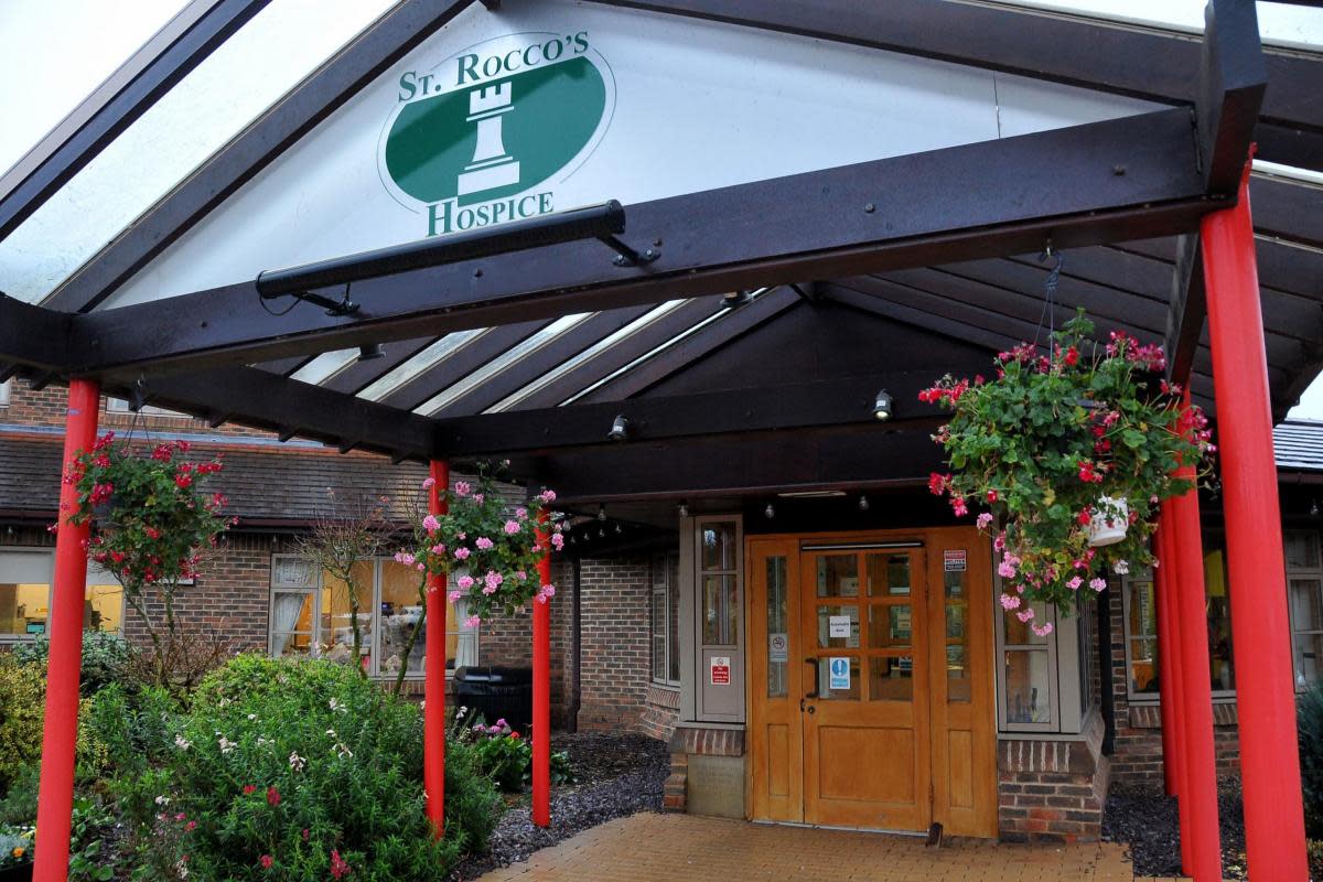
ST Rocco’s Hospice has updated its branding to remind people of its mission.
The Bewsey facility, which first opened in 1985, offers social, psychological, and spiritual support - as well as managing physical symptoms and providing bereavement care.
Now it has updated its branding to ‘match its mission’.
One change is that it has included its tagline ‘making every day count’ in its logo.
“Including our tagline in our logo emphasises we are making every day count to people who need it at the most vulnerable time in their lives,” a spokesperson for St Rocco’s said.
Supporters, volunteers and staff members at the hospice also gave the feedback that green should be prominent colour of the branding due to it being the colour that most people associate with St Rocco’s.
So to compliment the green, the team chose blue which they say is traditionally associated with calmness, dignity, and loyalty which they think are important qualities that represent St Rocco’s wide range of care and services.
The hospice has also confirmed that its logo is a tower – which signifies a tower of strength within the Warrington community – not a chess piece, as they are often asked.
A heart has also been added to the logo to represent the hospice’s compassion.
The changes to the logo may not be spotted straight away as signs and materials will only be updated when they are needed, it will be an ongoing process over time.
The rebrand work did not cost the hospice anything, instead it was a project of love involving volunteers, staff, and trustees.
A spokesperson for the hospice said: “Our brand refresh has been launched in time for of our 40th year celebration in 2025 as a commitment to modernising our look and services so that we can carry on caring in the ways that our evolving community needs long into the future.”

