
 Yahoo News
 Hong Kong celebrates design guru who left his mark
Some of Hong Kong's most recognisable designs, from the logo of the territory's biggest bank to the badge of its ubiquitous jockey club, are on display as one collection as the city celebrates the work of creator Henry Steiner.
Steiner's logos adorn the skyscraper headquarters of multinational companies, emblazon the shopping bags of neighbourhood supermarkets and upmarket department stores, and can even be seen on the face of banknotes issued in the territory.
The designs have for decades been familiar to Hong Kong's 7.5 million people -- as well as countless visitors -- but not many people realise they all came from the mind of one man.
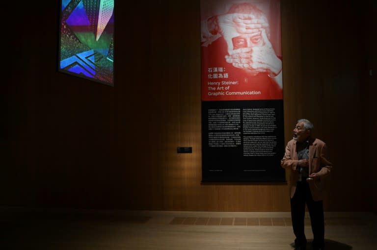
Now 90, having lived in Hong Kong since arriving as a 27-year-old in 1961, Steiner reflected on the changes he has seen as he wandered around an exhibition of his work at the city's M+ Museum.
Hong Kong is "the most exciting place I can think of in Asia", he told AFP.
"It's a place that has that spirit... what do you call it... the can-do spirit," he added.
Steiner appears unbothered by the debate on shrinking freedoms in Hong Kong following the huge and at times violent democracy protests of 2019, and the enactment of two sweeping national security laws.
"Hong Kong is a place that moves. And it stimulates you... It's a place that has electricity," he said.
- Branding Hong Kong's change -
When Steiner arrived in Hong Kong, the concept of graphic design -- a new discipline he studied at Yale University under pioneering American Paul Rand -- barely existed.
Starting as a designer for Asia Magazine, Steiner's career blossomed as the city transformed from a manufacturing and reshipment port into an international business and financial hub.
His clients -- local and multinational brands -- were eager to impress the world.
"I give identity to different companies," Steiner said.
"There's a personality for every company, every client. And the idea is to try to get that personality."
A prominent example is the visual system centred around the "H" logo Steiner created in the 1970s for developer Hongkong Land.
Compact and concise, the logo with fine white lines running in a thick bold letter "H" incorporated the company's initial, the idea of floor plans, and the Chinese character for longevity.
- Communicate with signs -
Tina Pang, a co-curator of the Steiner exhibition, said his logos were "versatile and resilient".
"The simplicity and the directness with which Henry is able to crystallise the nature of the businesses that he works for means that they stand the test of time," Pang told AFP.
Born to a seamstress and a dentist in a spa town outside Vienna in 1934, Steiner brushed past World War II at the age of five when his parents took him to the United States to seek refuge.
He anglicised his name Hans to Henry, and began a lifetime of wandering.
"Perhaps if you are a wanderer and an exile and if you are shy and mistrustful, you rely on signs more than on people," Steiner wrote in his book "The Cross-Cultural Design".
And the purpose of graphic design -- his lifetime passion -- "is to communicate", he told AFP.
Asked which project was his favourite, the nonagenarian shrugged and spread his hands.
"The next one," he said.
su/fox/smw

