‘House of the Dragon’ Season 2 Bends the Knee to Complaints of Being Too Dark

“House of the Dragon” showrunner Ryan Condal recently acknowledged that he’d heard the complaints: The Season 1 cinematography was too dark and he promised to make adjustments in Season 2.
“We went into Season 2 very conscious of that feedback,” Condal told The Hollywood Reporter. “Season 2 is much more in line with my particular aesthetic and what I think the show should look like. It’s not a massive difference, but I don’t anticipate getting the ‘it’s too dark’ note again.”
More from IndieWire
After watching the first four episodes of Season 2, IndieWire can confirm there have been significant adjustments made both to the lighting and color grade. Fans who complained can take comfort that they have most definitely been heard. The adjustments should move the series out of the danger zone of being “too dark” for poorly calibrated televisions and the cruel variance of compression (although is any non-daylight contrast ever “streaming safe”?). However, the solve is at times clumsy and fights against the series’ underlying visual design.
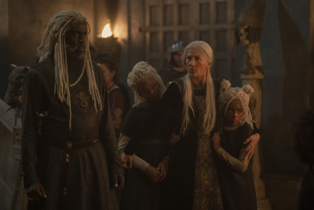
Scenes in the Red Keep, the primary setting for much of the palace intrigue, is where the lighting differences are most noticeable and easiest to compare to Season 1. The same sources motivate lighting — long tall windows, candles, fireplaces — but increased fill light and a brighter color grade prevent principals from falling into darkness.
Flames are no longer cast against black. Instead, they radiate a far-ranging, pulsing orange glow onto walls and throughout the rooms. The use of atmosphere, adding a foggy texture, is now visible beyond hard shafts of window light; the illuminated whitish-grey haze becomes a familiar backdrop.
Areas of the castle still fall into silhouette, but Season 2 EP/director Alan Taylor prefers to use unlit architecture to add depth to the composition and frame a scene. With the characters’ dramatic stage rarely permitted such inky blacks, viewers will see far more of the intricate detail work of the stone, furniture, and costumes.

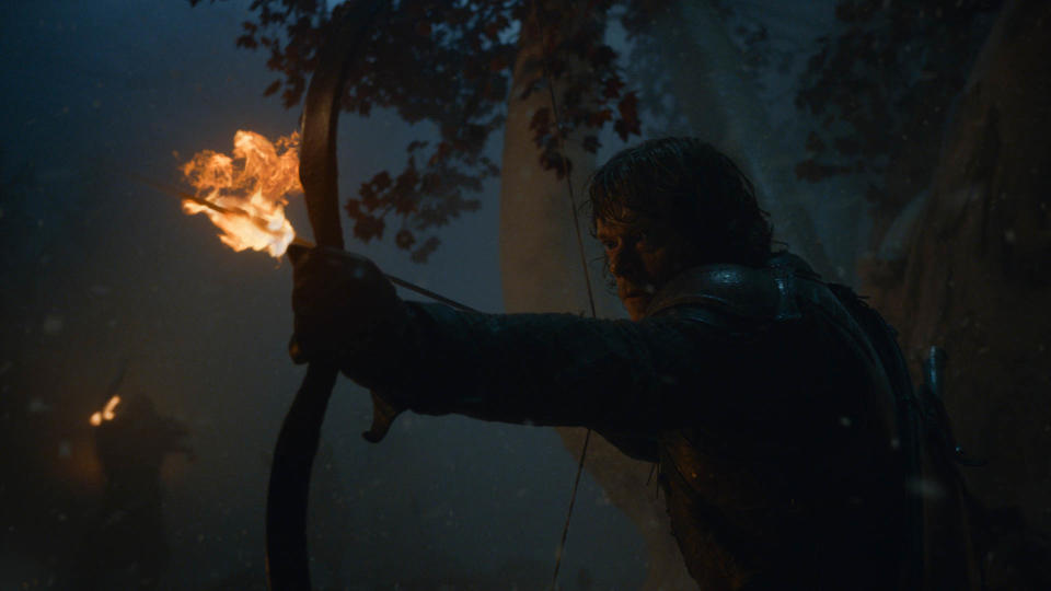
The loudest and most vehement viewer complaints came after the “The Longest Night” episode during the last season of “Game of Thrones” and with “House of the Dragon” Season 1, Episode 7. That one prompted the HBO social media account to respond, acknowledging that “The dimmed lighting of this scene was an intentional creative decision.”
Both episodes were directed by Miguel Sapochnik, who helmed many of the biggest episodes in the final three seasons of “Game of Thrones,” and was the Season 1 co-showrunner on “House of the Dragon.” Condal was the writing EP overseeing the story, Sapochnik the directing EP overseeing the department heads and production. With Sapochnik’s departure, Condal is now the sole Season 2 showrunner.
Dating back to the last season of “Game of Thrones,” Sapochnik defended the expressive use of lighting. On IndieWire’s Toolkit podcast he spoke at length of the pivotal “The Longest Night” episode, which he saw as being about “the last hope humanity has, the last beacon of light,” while detailing the unprecedented 55-night shoot and his filmmaking choices.
For Sapochnik, darkness and the expressive use of lighting was the point, but he said that the parts of the frame that needed to be visible, were — at least on the wide variety of screens he tested it on. Following Season 1, Condal himself acknowledged the problem.

“It looked great in post and it looked great on my television,” said Condal of Season 1 darkness complaints. “For TV, you’re releasing it onto a million different television screens and different setups and calibrations all over the planet… it’s hard to account for everybody’s televisions and their calibrations and sometimes the file can get compressed. So the show can look very different than the thing that we saw and approved and released.”
This speaks to a larger issue that plagues all directors and cinematographers: How do you construct visuals to be properly consumed in the streaming era? So often, what filmmakers see on their monitors and in controlled environments can be destroyed by a thousand cuts. Many of the great cinematographers I’ve interviewed over the years agree with Sapochnik: If filmmakers make adjustments to accommodate those who watch on their iPhone, you sacrifice the product for those who watch in a darkened home theater setting. On the flip side, it’s not the viewer’s fault that streaming brought tremendous compression and image quality loss, which is particularly rough on the darker parts of frame.
“Game of Thrones” has become the standard bearer for this issue. It’s a gravity-defying franchise that continues to grow its audience and it’s set in a world of literal and figurative darkness. The backdrop of a pre-electric fantasy world finds protagonists jostling for power inside the walls of stone castles as they plot betrayal, revenge, the sacrifice of family. All seem to be a handful of months, or episodes, removed from a devastating or stage of grief. “The House of Dragons” Season 1 opening titles set the tone with streams of blood flowing and converging over the dark stone as the credits rolled; Season 2 has a significantly different open.
Sapochnik and the Season 1 team did more than employ chiaroscuro lighting to elevate this drama. The series’ look, feel, and lighting design was built into production designer Jim Clay’s impressive Red Keep set and the visual architecture of the entire series. While it’s a dance with a devil to put these darker images into a streaming world, darkness problems were never going to be solved by turning up the dial in the color grade or adding an extra light.
The Season 1 design is hardly the only way to tell this story, but when you maintain the same visual architecture and reach for a mushy middle ground that will play on any device, you run the risk of a muddy image. And the thing I find most depressing about the look of Season 2 is it has taken a huge step toward looking like everything else on TV and lost some of what made it visually distinct.
In rewatching Season 1 episodes after the Season 2 screeners, it’s easy to appreciate what we took for granted and see how lighting was part of an overall visual approach that elevated the drama. Season 2 looks worse, but the heavier burden is what the change represents. This a rabid fan base that tunes in every Sunday night. If there was a chance for a show to get people to put their phones down, google how to adjust their TV settings and give themselves over to an onscreen viewing experience, it was this franchise. Instead, it has bent the knee.
Best of IndieWire
The Best Father and Son Films: 'The Tree of Life,' 'The Lion King,' 'Nowhere Special,' and More
The 51 Best Sexy Movies of the 21st Century, from 'Spring Breakers' to 'X'
The 14 Best Thrillers Streaming on Netflix in June, from 'Fair Play' to 'Emily the Criminal'
Sign up for Indiewire's Newsletter. For the latest news, follow us on Facebook, Twitter, and Instagram.

 Yahoo News
