
 Yahoo News
 People Are Only Just Finding Out Why McDonald's Use Red In Their Branding
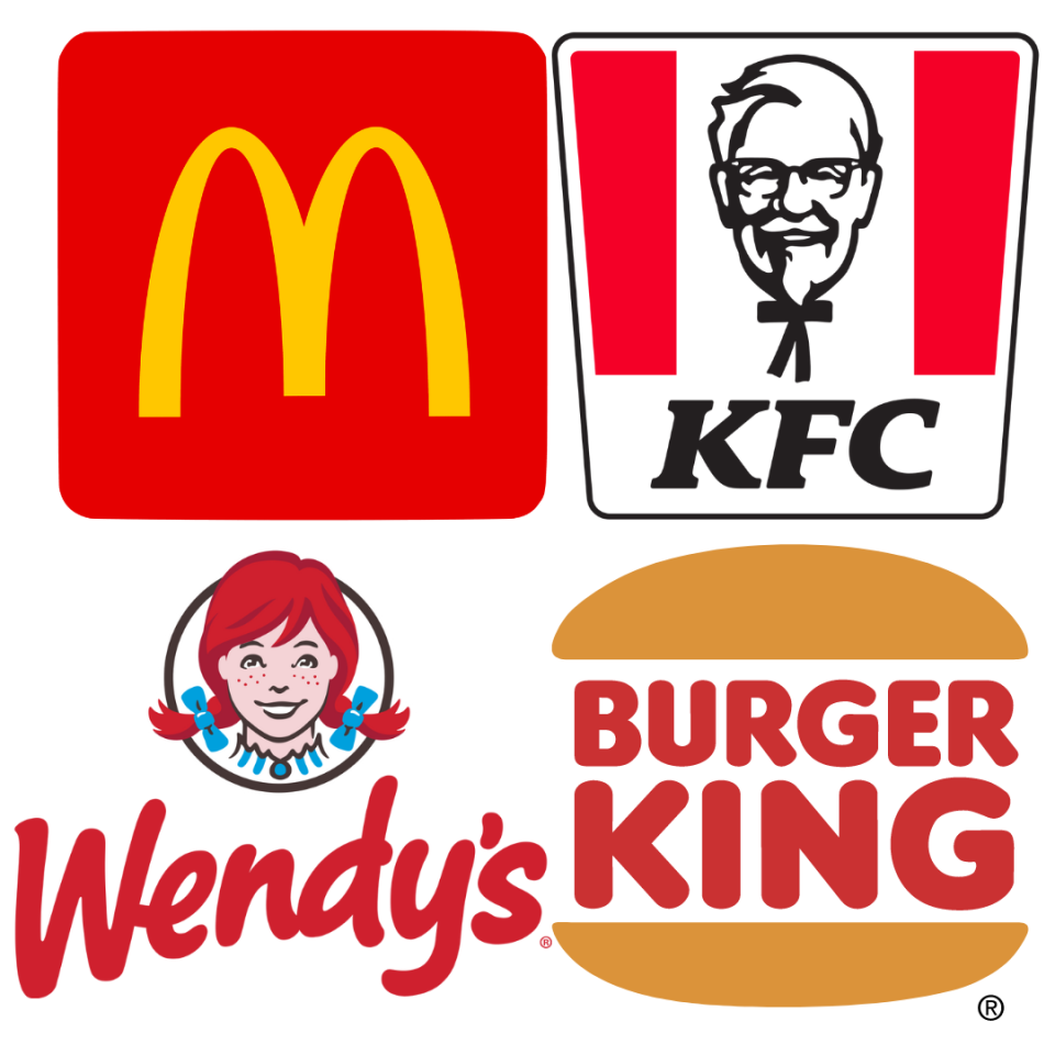
Have you ever wondered why your favourite fast food brands use the colour red in the their branding? Us too.
While the logos and signage of McDonald's, Burger King and KFC are so everyday that we almost don't notice them, there's actually a lot going on in our brains when we register the iconic symbols, colours and shapes.
New research has revealed that red or pink occupies 41% of the food industry when it comes to branding. According to print company Solopress, this is no surprise, as red is a colour known to energise and drive people into action.
Katie Hart, neuromarketing expert, comments: “longer wavelength colours, like red, are known to have a stimulating effect on recipients. They arouse us and drive us into action. At some levels, red colours increase our appetite, heart rate and even blood pressure, making us act faster, be more impulsive and potentially eat more.
“Can you see why this is such a popular colour to use in the food and drink industries, particularly fast food chains?”
The research from Solopress also revealed that blue features in the logos of 31% of the most successful brands of all time, including huge companies like Facebook and Twitter.
Red follows shortly behind in second place as it features in 24% of the most successful brands of all time, and is particularly relevant for successful food and drink brands.
Purple is the colour least associated with successful brands, with just 2% of the most successful companies using purple in their branding. Sorry about that, Taco Bell.

