
 Yahoo News
 How ‘I Saw the TV Glow’ Created Fictional ’90s Drama ‘The Pink Opaque’

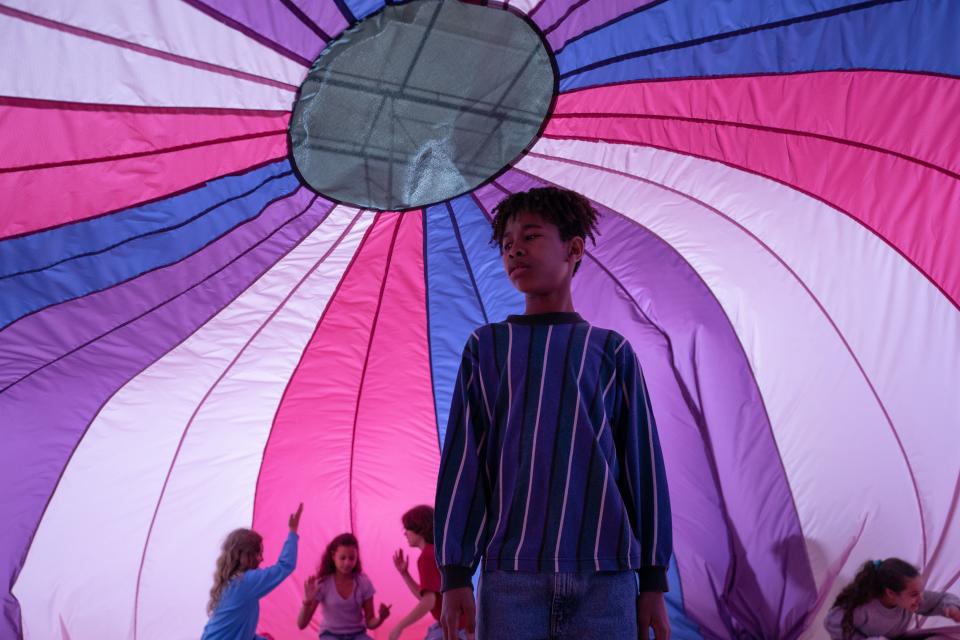
Jane Schoenbrun’s “I Saw The TV Glow,” out in limited theaters now, is about teenagers Maddy (Brigette Lundy-Paine) and Owen (Justice Smith), who bond over a “Buffy the Vampire Slayer”-style TV show, “The Pink Opaque.” As they continue to get more into the lore of the television show, the edges blur between the reality of their lives and “The Pink Opaque.”
Schoenbrun has described “Buffy” as a pivotal show for them while they were growing up, so creating their version of that felt like giving their 13-year-old self a gift. So getting “The Pink Opaque” just right was monumental.
More from IndieWire
What Forced the Cannes Market to Offer Smarter Movies? Strikes Get Some of the Credit
Would Adding 'Apes' Character Koba Make Other Movies Better? Social Media Seems to Think So
The premise of “The Pink Opaque,” like most ’90s shows, is perfectly silly and immediately nostalgic. Isabel (Helena Howard) and Tara (Snail Mail’s Lindsay Jordan) meet at summer camp and realize they have an ancient, psychic connection. When camp ends, the two are able to meet on a psychic plane where they realize they must fight the monsters sent by the evil Mr. Melancholy, who is the man in the moon, trying to trap them in the Midnight Realm.
“The Pink Opaque” needed to feel real enough that Maddy and Owen’s connection to it felt serious. For production designer Brandon Tonner-Connolly, who has worked on “Reservation Dogs” and “The Big Sick,” the key to creating the show was Schoenbrun. “I think one thing that Jane said in that [director’s] statement was that the movie would be a shimmering haunted wonderland and that it wouldn’t look like ’90s TV shows, but instead it would look and feel like the memory of watching them, which the coolest thing I’d ever read,” Tonner-Connolly told Indiewire.
While “The Pink Opaque” was supposed to be hazy and nostalgic and intoxicating, it still needed to be in conversation with the rest of “I Saw the TV Glow.” DP Eric Yue, who worked on “A Thousand and One,” prepped for a few months with Schoenbrun on the color palette of the film. Schoenbrun wanted the film to be very colorful — blues, purples, and pinks — and they watched Krzysztof Kieślowski’s “Three Colors” trilogy for color inspiration. “In ‘Blue,’ there’s that scene where it’s this blue kind of crystal and it reflects onto her face. And Jane was like, ‘That’s the kind of intensity of blue that I want.’ We took that as a prompt and that kind of blue seeped into our film,” Yue told IndieWire. And for “The Pink Opaque,” the lighting got even more theatrical. “I was using blue gels for nighttime, which is a way of seeing night moonlight back in the ’90s, hard shafts of light and being a little aggressive with the fill light and the use of fog and more open to the fantastical nature of the show.”
Aside from creating the visual language of “The Pink Opaque,” they also had to create storylines and seasons. Tonner-Connolly ordered episode guides for “Buffy” and other ’90s shows to study episode titles and plot lines — and then he made an episode guide for “The Pink Opaque.” “It was really fun because we see the episodes that are in the movie, and we shot more stuff than is actually in the final cut,” Tonner-Connolly said. “But ‘The Pink Opaque’ episode guide was my opportunity to help to flesh out that world. So we came up with episode names, plot lines, stills taken from the episode, quotes, trivia, all this stuff. We had sections there that were supposed to be from the costume designer of the show, that was costume sketches. I really wanted it to be a totally legit episode guide that Bridget or anybody could flip through and see something that was real and felt kind of compelling to them.”
As any “Buffy” stan knows, getting the monsters right — meaning both cheesy and terrifying — is key to what makes the show click. So the monster design for “The Pink Opaque” was pivotal, especially the big bad, Mr. Melancholy, who was inspired by everything from The Smashing Pumpkins’ album “Mellon Collie and the Infinite Sadness” to Georges Méliès’ “A Trip to The Moon” to the McDonald’s Mr. Moon character.
“We kind of knew that we’re not going for hyperrealistic here; we’re going for something that feels slightly two-dimensional, at least the face and the moon,” Yue said. Played by Emma Portner, Mr. Melancholy’s design initially used makeup to create the face of a man in the moon, but Schoenbrun wanted it to be more intense. They then did CG makeup, added more craters, and then they kept going. “It’s almost like it’s a skin disease that he’s fighting and the movement is growing over it. So those craters are growing and dissipating. We developed that whole system of ‘moonalitus,’ I don’t remember what Jane called it, but it’s constantly fighting that moon thing that comes in and out,” VFX supervisor Yuval Levy told IndieWire.
One of the most heartbreaking parts of the film might be when Owen watches “The Pink Opaque” as an adult, and it’s nothing like he remembered. It’s hacky and childish and brightly lit. They invited some of Schoenbrun’s filmmaker friends, including “Strawberry Mansion” director Albert Birney, to film utilizing the “Pink Opaque” props and aesthetic. “There’s an interesting thing where it’s his own interpretation of what a bad version of that show is,” Yue said. “And then there’s stuff that we were making. It is interesting that it exists almost separately from the stuff that we were making. Albert was making it while we were shooting as well, and we were sort of seeing what he was making and drafts of it.”
As emotional as “The Pink Opaque” is within the context of “I Saw the TV Glow,” it was equally emotional for the production team. “It has a lot of big, nostalgic parts for me. This was when I was a teenager,” Levy said. “I don’t need a lot of references. I just got to go back in time. So it’s in me, it’s in all of us. It’s an emotional time of growth of self-exploration. So I knew exactly where it’s in there. You don’t need to look far. You just look, and you find it.”
Best of IndieWire
The 13 Best Thrillers Streaming on Netflix in May, from 'Fair Play' to 'Emily the Criminal'
The Best Father and Son Films: 'The Tree of Life,' 'The Lion King,' and More
The 10 Best Teen Rebellion Films: 'Pump Up the Volume,' 'Heathers,' and More
Sign up for Indiewire's Newsletter. For the latest news, follow us on Facebook, Twitter, and Instagram.

